Making content understandable by applying the correct layouting techniques is at the very core of a designer's or front-end developer's business. We apply the Gestalt principles for directing how objects are perceived. I am pleased to implement the designs of a colleague who is very skilled in this regard. Recently, she created a very interesting component which was great fun turning it into code. Let's experience this journey.
We want to create a list of features which are laid out horizontally. The list items should be separated with a bullet point. If the container is too small the list should wrap. You can see it live as part of the storefinders on Merkurmarkt.at, Penny.at or Pennymarket.it when selecting a store.
The markup
Creating semantic markup is straight-forward for this component. A button is a <button>, a table is a <table> and a list is a <list>. Wait, there is not a single list element but <ul> and <ol>?! Now, we could either write a grand unification proposal or find out why there is a differentiation. The U in <ul> stands for unordered. It should be used when the sequence does not matter. The ordered list is for the opposite. In our case, the information can be placed in random order and would be equally valid. So we end up with this structure.
<ul>
  <li>parcheggio</li>
  <li>Panetteria</li>
  <li>Pagamenti con carta di credito</li>
  <li>Macelleria</li>
</ul>
The styles
Creating the styles is the interesting part. First, we want to achieve the horizontal orientation. So let's make the list a flexbox and also remove the padding.
ul {
  display: flex;
  padding-left: 0;
}<ul>
<li>parcheggio</li>
<li>Panetteria</li>
<li>Pagamenti con carta di credito</li>
<li>Macelleria</li>
</ul>We see that the bullet points are overlapping. This can be fixed by setting the markers to be inside the box of the list item. Additionally, we add a bit of spacing between the list items and the same spacing between the marker and the list item. If we try that we will notice that it does not work in a straight-forward way or, at least, I did not manage to get the spacing right. Removing the default list-styling and creating the bullet points on our own makes it a lot easier. Notice that we should add the role property because of a clever but unexpected behaviour in VoiceOver.
ul {
  display: flex;
  padding-left: 0;
  list-style: none;
}
li {
  padding-left: 1ch;
}
li::before {
  content: '•';
  margin-right: 1ch;
}<ul role="list">
<li>parcheggio</li>
<li>Panetteria</li>
<li>Pagamenti con carta di credito</li>
<li>Macelleria</li>
</ul>It looks quite good already. What is missing? We don't want the first element to have a bullet point. My first reaction was to apply the pseudo-element only to the other items. It will turn out to be a bad decision later but let's go for it now. Make sure to take a look at the result.
ul {
display: flex;
padding-left: 0;
list-style: none;
}
li:not(:first-child) {
padding-left: 1ch;
}
li:not(:first-child)::before {
content: '•';
margin-right: 1ch;
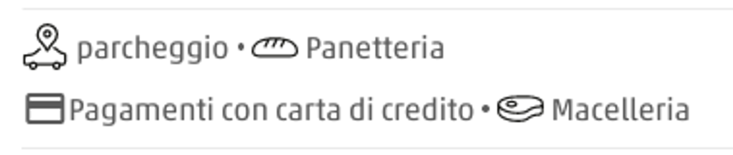
}<ul role="list">
<li>parcheggio</li>
<li>Panetteria</li>
<li>Pagamenti con carta di credito</li>
<li>Macelleria</li>
</ul>Lovely! Everything is just as it should be. "But Jan, you told me that this solution is not perfect." Yes, let's see what happens if the items need to wrap? First, we allow wrapping in our flexbox. I also added some demo code to show the bounds of the <ul> and limit its size to force the wrapping of items.
ul {
display: flex;
flex-wrap: wrap;
padding-left: 0;
list-style: none;
}
li:not(:first-child) {
padding-left: 1ch;
}
li:not(:first-child)::before {
content: '•';
margin-right: 1ch;
}
/* demo code */
body {
padding: 2em;
}
ul {
outline: 1px solid hotpink;
max-width: 40ch;
}
<ul role="list">
  <li>parcheggio</li>
  <li>Panetteria</li>
  <li>Pagamenti con carta di credito</li>
  <li>Macelleria</li>
</ul>The wrapped list items have a bullet point 😱. Time for some CSS wizardry! Let's give every element a bullet point again so that the rows are aligned. We now move the entire list to the left by the size of our list decoration (+ its spacings). For this reason, we have to specify a width for the pseudo-element. In the next step, we can use clip-path to cut off the unwanted bullet points. Again, clip-path saves us.
ul {
display: flex;
flex-wrap: wrap;
padding-left: 0;
list-style: none;
margin-left: -3ch;
clip-path: inset(0 0 0 3ch);
}
li {
padding-left: 1ch;
}
li::before {
content: '•';
display: inline-block;
margin-right: 1ch;
width: 1ch;
text-align: center;
}
/* demo code */
body {
padding: 2em;
}
ul {
max-width: 40ch;
}
<ul role="list">
  <li>parcheggio</li>
  <li>Panetteria</li>
  <li>Pagamenti con carta di credito</li>
  <li>Macelleria</li>
</ul>The scripts
Tumbleweed rolling from one side of the screen to the other. No Gif here because I am sure you can imagine it.
Conclusion
A simple design turned out to be surprisingly challenging to implement. But we should not stop there and dismiss the design! CSS is a very powerful language which can do more than you might think in the first moment. It is worth experimenting with it. At worst, you learn something. At best, you solve the problem along the way.