Drawing shapes in CSS is handy sometimes. The one shape I keep looking up regularly is the triangle hack using borders. I also used it as part of the project Angehörigendialog where I spend a lot of time making a website look good on print. By doing so I encountered many huge browser quirks and also a rather small and insignificant Firefox bug affecting my beloved triangle shape hack. Thus, I want to give it the attention it wouldn't get otherwise.
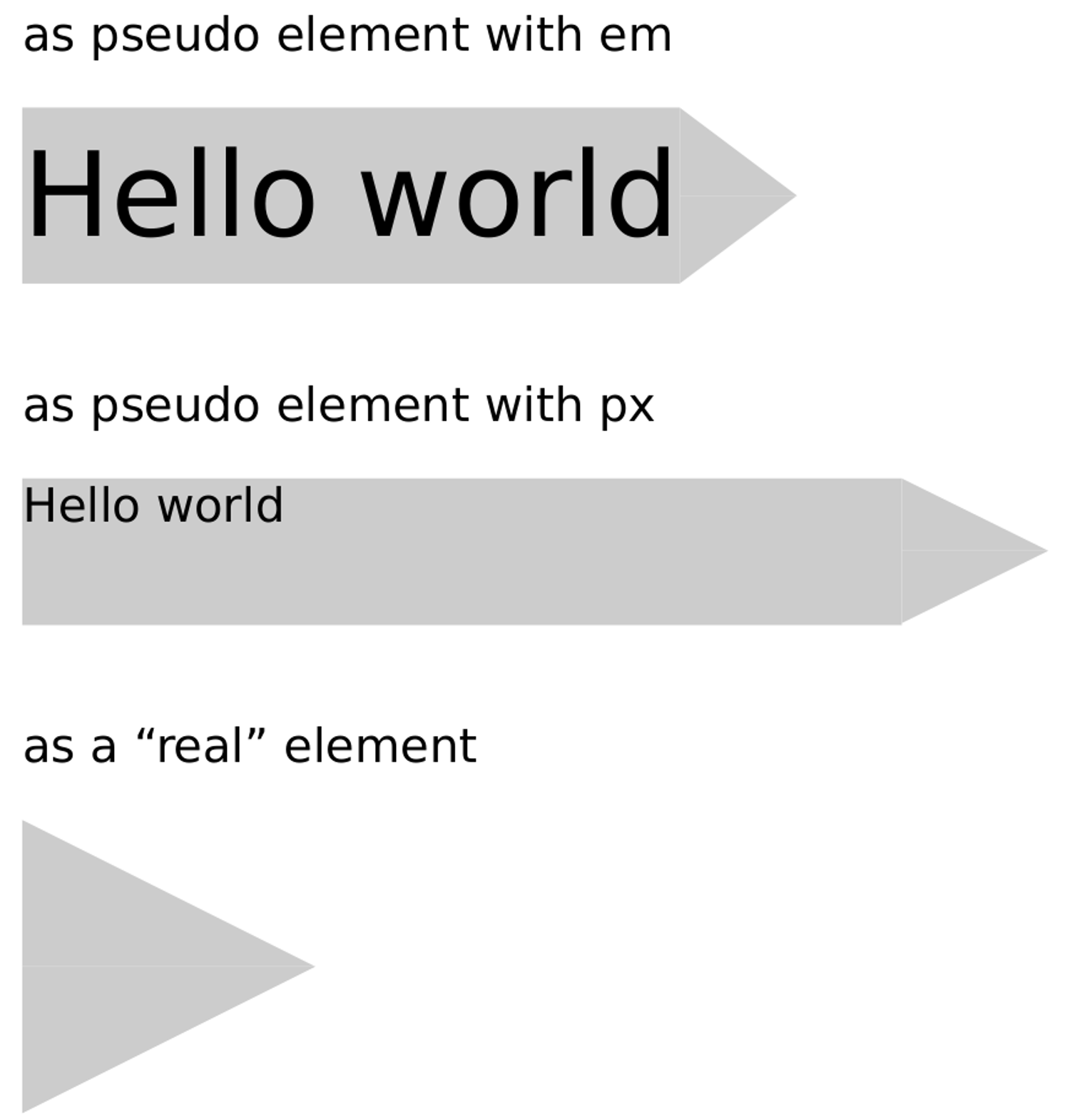
In the Codepen that I prepared for you, you can see different implementations of the triangle shape using the border hack and an alternative solution. The first one calculates the size of the triangle according to the font size. This was the original implementation I had in the project. Just to make sure that it has nothing to do with the relative unit or the fact that it is a pseudo-element, I created the following examples.
See the Pen Firefox PDF printing bug by @kjan on CodePen.
When you print it to a PDF in Firefox and look very closely at the result (zoom in a little maybe), you will see the issue. Depending on your PDF reader you will see different artefacts. For me, the triangle is split in half and also a little shifted to the right. In Chromium, the problem is less apparent to me. Here, the triangle has only a small vertical offset. For your convenience, I included the PDF below (created with Firefox 83 on Linux). I case, you do not have the problem on your machine, please have a look at the screenshot.
I case, you do not have the problem on your machine, please have a look at the screenshot.

One might argue that it is ridiculous and a waste of time to worry about this. Well, sure, I guess. I did it anyway and now you are doing it too. So, I would like to present to you an alternative which does not face this problem. The CSS property clip-path can cut out a part of your element. You have to supply a shape and it will remove the overlapping parts for you. In our case, we create a polygon by defining the points (x y). We can use absolute values but also percentages for this. The padding in the example below should be the width of the appended triangle. The polygon's path can then go all the way to the right and back by the size of the padding: calc(100% - 1em). This allows you to only have one element in your DOM having this cool triangle at the end. In other cases, you might want to create the triangle in an extra element. This is even more straight-forward.
.clip {
  padding-right: 1em;
  clip-path: polygon(
    0 0,
    calc(100% - 1em) 0,
    100% 50%,
    calc(100% - 1em) 100%,
    0 100%
  );
}

.clip-triangle-only {
  height: 50px;
  width: 50px;
  clip-path: polygon(
    0 0,
    100% 50%,
    0 100%
  );
}
Thank you for reading this. I hope you had fun thinking about the tiny details in web development. Before you leave, I want to ask you a question. Do you stick with the border hack or will you use clip-path in the future? I like the alternative better because I can actually read and understand it. But there is the drawback that IE 11 does not support it. ¯\_(ツ)_/¯